
The ultimate web development tool for Confluence
Easily transform the look, feel, and usability of your Confluence instance with HTML, JavaScript, and CSS. live preview
What’s ThemeBuilder for Confluence?
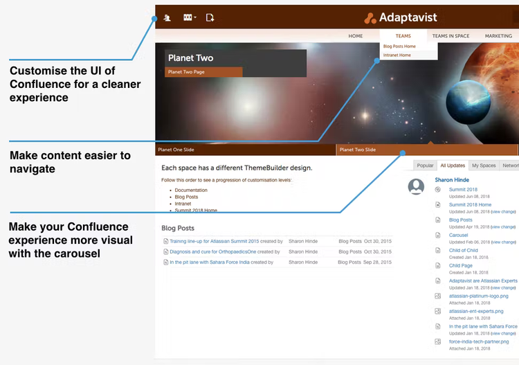
ThemeBuilder gives you the ability to fully customise your Confluence theme using HTML, CSS and JavaScript. Create an intranet or documentation experience that matches your brand and makes content navigation a breeze for your teams.
With ThemeBuilder you can:
- Easily customise and rearrange Confluence using building block styled code modules.
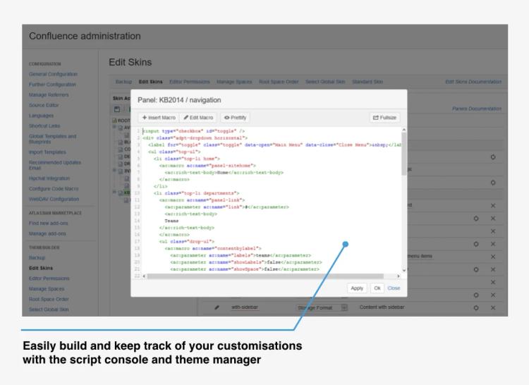
- Develop completely custom page layouts by scripting macros and HTML.
- Show or hide page and UI elements that make sense for your company or teams.
- Ensure highlights and important content stand out using the carousel.
- Build standardised layouts that match the Confluence codebase— your custom pages will stay just how you built them, even when new Confluence versions are released.
Pricing
The intervals shown below are not exhaustive and merely indicate how the price of ThemeBuilder for Confluence scales to different team sizes.
To get the right price for your organisation, please click through to the Atlassian Marketplace.
Monthly
Yearly
Data Center
| Team size | Price |
|---|---|
| 500 | - |
| 1,000 | - |
| 2,000 | - |
| 3,000 | - |
| 4,000 | - |
| 5,000 | - |
| 10,000 | - |
| 15,000 | - |
| 20,000 | - |
| 25,000 | - |
| 30,000 | - |
| 35,000 | - |
| 40,000 | - |
| 40,001+ | - |
Reviews
Try ThemeBuilder for free
Get access to ThemeBuilder today to customise your Confluence instance however you want.